Posted on

Change in Urban/Community Tree Cover by State

https://www.nrs.fs.fed.us/news/release/resources/cities-communities-losing-tree-cover/

You are here: NRS Home / News / Cities and Communities in the U.S. Losing 36 Million Trees a Year / State by state summary of change in community tree cover

Publications & Data

Change in Urban/Community Tree Cover by State


Year 1

Year 2

Change between years

State Years

%

SE

%

SE

%a

%/yrb

Acres/yrc

Alabama (2007-2014)

51.7

1.6

49.7

1.6

-2.0*

-0.32

-12,890

Alaska (2006-2012)

48.8

2.3

48.8

2.3

0.0

0.00

0

Arizona (2008-2014)

30.8

1.5

30.2

1.5

-0.6

-0.11

-6,190

Arkansas (2009-2013)

47.3

1.6

46.9

1.6

-0.4

-0.08

-1,430

California (2009-2014)

39.4

1.5

39.0

1.5

-0.4

-0.08

-7,890

Colorado (2007-2013)

21.8

1.3

21.6

1.3

-0.2

-0.03

-610

Connecticut (2008-2014)

63.0

1.5

62.7

1.5

-0.3

-0.05

-640

Delaware (2006-2011)

35.8

1.5

35.3

1.5

-0.5

-0.10

-290

District of Columbia (2010-2015)

36.1

1.5

33.9

1.5

-2.2*

-0.44

-170

Florida (2009-2014)

49.0

1.6

47.6

1.6

-1.4*

-0.26

-18,060

Georgia (2009-2014)

63.4

1.5

61.4

1.5

-2.0*

-0.40

-18,830

Hawaii (2010-2015)

50.2

1.6

50.1

1.6

-0.1

-0.02

-150

Idaho (2008-2014)

14.2

1.1

13.8

1.1

-0.4

-0.07

-420

Illinois (2008-2013)

30.9

1.5

29.9

1.4

-1.0*

-0.20

-6,910

Indiana (2008-2013)

30.8

1.5

30.1

1.5

-0.7*

-0.13

-2,790

Iowa (2008-2013)

21.9

1.3

20.9

1.3

-1.0*

-0.20

-2,870

Kansas (2009-2014)

31.0

1.5

30.3

1.5

-0.7*

-0.13

-1,450

Kentucky (2008-2014)

39.8

1.5

38.9

1.5

-0.9*

-0.16

-2,500

Louisiana (2009-2014)

47.6

1.6

47.3

1.6

-0.3

-0.06

-1,330

Maine (2008-2013)

68.4

1.5

68.1

1.5

-0.3

-0.06

-510

Maryland (2009-2014)

53.4

1.6

53.1

1.6

-0.3

-0.06

-1,020

Massachusetts (2008-2014)

59.7

1.6

58.4

1.6

-1.3*

-0.23

-4,930

Michigan (2008-2014)

46.7

1.6

45.9

1.6

-0.8*

-0.13

-3,810

Minnesota (2009-2014)

46.7

1.6

46.7

1.6

0.0

0.00

0

Mississippi (2009-2014)

52.4

1.6

52.7

1.6

0.3

0.06

1,000

Missouri (2010-2015)

40.1

1.5

39.7

1.5

-0.4

-0.08

-1,860

Montana (2009-2014)

37.1

1.5

37.2

1.5

0.1

0.02

470

Nebraska (2009-2014)

20.4

1.3

18.8

1.2

-1.6*

-0.32

-1,800

Nevada (2009-2014)

27.0

1.4

26.8

1.4

-0.2

-0.04

-900

New Hampshire (2009-2015)

64.4

1.5

63.0

1.5

-1.4*

-0.25

-1,650

New Jersey (2008-2013)

48.4

1.6

47.8

1.6

-0.6*

-0.12

-2,590

New Mexico (2010-2015)

21.9

1.3

22.1

1.3

0.2

0.04

790

New York (2008-2013)

53.4

1.6

52.4

1.6

-1.0*

-0.19

-6,720

North Carolina (2010-2015)

54.8

1.6

54.2

1.6

-0.6

-0.11

-4,510

North Dakota (2009-2013)

10.7

1.0

10.1

1.0

-0.6

-0.13

-590

Ohio (2009-2014)

39.2

1.5

38.2

1.5

-1.0*

-0.20

-7,230

Oklahoma (2009-2014)

35.6

1.5

34.0

1.5

-1.6*

-0.30

-9,710

Oregon (2008-2014)

35.6

1.5

33.9

1.5

-1.7*

-0.30

-3,450

Pennsylvania (2007-2013)

46.8

1.6

46.2

1.6

-0.6

-0.11

-4,320

Rhode Island (2010-2015)

54.5

1.6

52.3

1.6

-2.2*

-0.44

-1,260

South Carolina (2009-2014)

54.8

1.6

53.6

1.6

-1.2

-0.23

-5,190

South Dakota (2008-2014)

13.9

1.1

13.6

1.1

-0.3

-0.05

-280

Tennessee (2008-2013)

48.4

1.6

46.9

1.6

-1.5*

-0.27

-9,060

Texas (2009-2015)

28.9

1.4

28.3

1.4

-0.6*

-0.11

-10,180

Utah (2010-2015)

16.7

1.2

16.6

1.2

-0.1

-0.02

-360

Vermont (2010-2015)

57.5

1.6

56.6

1.6

-0.9*

-0.18

-370

Virginia (2009-2014)

51.5

1.6

51.0

1.6

-0.5

-0.10

-2,970

Washington (2009-2014)

42.3

1.6

41.6

1.6

-0.7

-0.14

-3,350

West Virginia (2008-2014)

61.9

1.5

61.3

1.5

-0.6

-0.11

-790

Wisconsin (2009-2014)

38.8

1.5

38.3

1.5

-0.5*

-0.10

-2,340

Wyoming (2009-2014)

15.8

1.2

15.8

1.2

0.0

0.00

0

Total US (2009-2014)

42.9

0.4

42.2

0.4

-0.7*

-0.12

-174,940


Footnotes:

a Change in percent tree cover between years.
b Annualized change in percent tree cover between years.
c Annualized change in tree cover (in acres) between years.
* Statistically significant change at alpha = 0.05.

Source:
Nowak, David J.; Greenfield, Eric J. 2018. Declining urban and community tree cover in the United States. Urban Forestry & Urban Greening. 32: 32-55. https://doi.org/10.1016/j.ufug.2018.03.006.


For additional information, please contact David Nowak.

Posted on

How Big Forests Solve Global Problems

Op-Ed Contributors

How Big Forests Solve Global Problems

By Thomas E. Lovejoy and John Reid

Mr. Reid has pioneered the use of economic insights to conserve forests and other ecosystems globally. Mr. Lovejoy has worked in the Amazon (the largest tropical forest) since 1965.

Image
A tropical rainforest with a small river inside the heart of Madidi national park, Bolivia.CreditCreditTomas Zrna/Moment Open, via Getty Images

Sit on a log by the Madidi River in Bolivia at dusk and you can hear what an Amazon forest should sound like. The music includes red howler monkeys, breathy thumps from the mutum jungle fowl, droning cicadas, eerie calls locals attribute to deadly bushmaster vipers and the unhinged excitement of elusive titi monkeys. Around your feet, the beach is crisscrossed by jaguar tracks and those of the pony-size tapir, a shy beast that, if you keep quiet, will saunter out of the forest and swim across the river.

This is what scientists call an “intact forest landscape.” It’s a swath of at least 500 square kilometers (about 193 square miles, equal to 70,000 soccer fields) of unbroken forest. Because of their size, these areas have maintained all their native plant and animal life and biophysical processes. These forests still adorn parts of our planet’s tropical midsection, notably the Amazon, Congo Basin and the island of New Guinea. And they form a northern belt, the boreal forests of Canada, Russia, Alaska and Scandinavia.

Intact forests today total around 11.8 million square kilometers (about 4.6 million square miles), according to estimates by a group of researchers and organizations, including Greenpeace, Global Forest Watch, World Resources Institute, Transparent World, University of Maryland, World Wildlife Fund of Russia and Wildlife Conservation Society. That’s roughly the United States and Mexico combined. It’s about a quarter of the planet’s total forest area, the rest of which is fragmented by roads, mines, cities and agriculture. Over 7 percent has been lost since 2000. Keeping the rest is a key to turning around three stubborn global trends: climate change, the sixth great extinction crisis and the loss of human cultures.

In the tropics, intact forests hold 40 percent of the aboveground forest carbon even though they make up only 20 of those latitudes’ forests. And intact forests have been shown recently to absorb enough carbon to offset many Amazon countries’ (like Peru) total emissions. When forests become fragmented, edge effects (forest damage at created edges), drying and fire cause over 150 million tons of annual emissions — more than result from outright deforestation.

The United States Environmental Protection Agency estimates suggest that those emissions cost us $6.3 billion in lost crops, flood damage, fires and other impacts. In the boreal region, forests protect permafrost, which, if it thaws, will be a huge source of heat-trapping methane emissions. Aside from maintaining the global climate, intact forests stabilize weather locally and regionally, which sustains livelihoods for millions of people.

Carbon has been fashioned by evolution into a staggering array of plants and animals, many of which are threatened by the current spasm of extinctions. The great intact forests host the most diverse ecosystems and robust populations of top predators, wide-ranging migrants and undiscovered species. They are evolutionary workshops still going full tilt. In places like the western Amazon, intact forests climb mountainsides, giving species altitudinal ladders to survive climate change.

The planet’s cultural diversity also depends on its big forests. Of the world’s approximately 6,900 languages, around a quarter are from the three great tropical forest regions (which have just 6 percent of the land area): 330 languages in the Amazon, 1,100 in New Guinea and its environs and 242 in the Democratic Republic of Congo, where most of Africa’s intact forests are. Unesco estimates that a language is lost every two weeks. Many are blinking out as the forests that sustain their speakers are eroded.

Humanity’s very ability to think certain thoughts depends on our great forests. When the renowned Harvard botanist Richard Evans Schultes first arrived in the Amazon (in 1941), he found that some Indians used the same word for “green” and “blue” but had 18 terms for varieties of a sacred vine that had been identified by baffled scientists as a single species.

Forest conservation solutions are practical and affordable. First, roads need to give big forests a wide berth. The principal underlying driver of fragmentation is road-building, which carves forests into progressively smaller patches and has accounted for 81 percent of losses since 2000. And they usually lose money. One study found that a major new highway in the Brazilian Amazon would return around 6.5 cents on each dollar of investment. Money is better spent by intensifying transportation near towns and existing farms, where the infrastructure can serve more people. A 2014 global study in Nature showed that needed road networks could be developed without fragmenting forests.

Second, forest peoples’ land rights need to be supported, for both ethical and practical reasons. There are almost no forests without people; intact forest wildernesses are forests with few people whose traditions and economies are woven into the landscape. Recent Amazon research shows that legally recognized indigenous territories are extremely effective at preventing deforestation, even where deforestation pressure is high. Parks and nature reserves were also revealed to be effective, especially when tailored to local needs.

Third, the adage that you can’t manage what you don’t measure applies here. A continuous, near-real-time system of monitoring must be put in place to track where intact forests are being cut so that governments, forest communities and private organizations can react early.

How will we pay for a future with forest wilderness? Part of the answer lies in programs to avert climate change. A recent economic study indicates that a large share of intact forests could be preserved at a cost of $20 per ton of carbon. That’s less than half of one indicative benchmark figure: the $52 midpoint price projected by California for its regulated carbon emissions market in 2030.

But for funds to flow, climate policies need to adapt. They now provide little incentive to conserve large, often remote forest areas. That’s because the forests are beyond the immediate frontier of expanding agriculture and therefore not recognized by climate protection regimes as targets for campaigns to avoid deforestation. It’s difficult to project the baselines of intact forest loss and degradation far into the future, and those predictions are needed to calculate the climate benefits of protecting them. But the United Nations Green Climate Fund and forested countries and donors should embrace that challenge and fill the funding gap.

It takes four days and a balsa wood raft to get to that beach in the Bolivian Amazon, which is a big part of the reason its big trees are still standing. Similarly epic journeys will get you to forest gems around the world, where, if you listen, you’ll understand a little more about where we came from and where we need to go from here.


Thomas E. Lovejoy is a professor of environmental science and policy at George Mason University. John Reid is the founder and former president of Conservation Strategy Fund and advises Nia Tero and the Field Museum in Chicago on economic and policy dimensions of protecting natural ecosystems and indigenous territories.

Follow The New York Times Opinion section on Facebook and Twitter (@NYTopinion), and sign up for the Opinion Today newsletter.

Posted on

What’s the worst kind of praise you can give?

Good advice for both leaders  and parents! Lee
https://ideas.ted.com/whats-the-worst-kind-of-praise-you-can-give/

What’s the worst kind of praise you can give?

One hint: it often ends with the letters “est.” And it can lead to competition and disappointment, says psychologist and workplace researcher Shawn Achor.

Shawn Achor

iStock

Some people treat praise like a limited commodity. They believe that the key to advancement and success must be to absorb and rack up as much recognition and admiration as possible. This is the philosophy we learn in school, then hone to brutal efficiency in the working world.

Yet what these people fail to recognize is that praise is actually a renewable resource. Praise creates what I call a virtuous cycle — the more you give, the more you enhance your own supply. When done right, praise primes the brain for higher performance, which means that the more we praise, the more success we create. And the more successes there are, the more there is to praise. The research I’ve been doing over the past five years shows that the more you can authentically shine praise on everyone in your ecosystem, the more your potential, individually and collectively, rises.

I know I’m not the first to tout praise’s benefits. And I’m willing to guess that most people recognize that praise is invaluable. The problem in most of our businesses, schools and relationships isn’t just that we fail to praise enough; it’s that we have been praising the wrong way. I would go so far as to say that our current model of praise demotivates our teams, exacerbates internal strife in our families, and places a cap on our potential.

By telling someone they are “better” or “the best,” you are placing a limit on your expectation for what they can achieve.

The worst piece of praise I’ve sometimes received after a talk is “You were the best speaker today.” What’s so bad about that? First of all, it undercuts all the other speakers. Moreover, it reminds me of the fact that in many other cases I won’t be the best speaker, so now I feel nervous and self-conscious. Instead of enhancing me, this comment unbalances me in the future.

What you’re actually doing here is comparing, not praising. You are attempting to prop people up by kicking others down. Real praise is telling someone “Your report was amazing,” or “The comedic timing of your speech was perfect,” not telling them that their report or their speech was better than another person’s. Moreover, by telling someone they are “better” or “the best,” you are placing an unconscious, implicit limit on your expectation for what they can achieve. If we’re striving only to be better than someone else, doesn’t that set our expectations for ourselves too low? It tells us that as soon as we are just a little bit better than another person, we can stop trying, even if it means stopping short of our potential.

If you want to enhance others, do not compare them. This has been one of the hardest lessons for me to write about, because I thought I was intuitively praising others, including my wife and son. But no matter how good your intentions, if you excitedly say to a child “You were the best one out there!” you just taught them that your love and excitement were predicated on their position compared to others. Nothing undercuts Big Potential — the success you can only achieve in a virtuous cycle with others — more than comparison praise.

The easiest way to stop comparison praise is to eliminate superlatives, like “the best,” “the fastest,” “the smartest,” “the prettiest.”

Think how often we fall for the comparison trap. “You are the hottest/smartest/funniest person in this room.” Why do we have to diminish everyone else in the room in an attempt to praise one individual? Comparison praise feeds into the Small Potential — the limited success that you achieve alone — mentality that success, leadership, creativity, beauty, love, or anything else that we care about are limited resources. When you tell a group of people that only a certain percentage of them can be successful, you are dampening everyone’s drive and ambition.

The easiest way to stop comparison praise is to eliminate superlatives from our vocabulary — “the best,” “the fastest,” “the smartest,” “the prettiest.” Instead, follow what I consider an inviolable law of praise for leaders and parents: Do not compliment someone at the expense of others. So, what’s the best compliment I could get after my talk? It’s when someone tells me they are going to start doing one of the positive habits I spoke about, or they’re going to buy my book for a friend who is struggling. The most authentic way to acknowledge someone is to change your behavior.

In the working world, the pox of comparison praise appears in the form of performance reviews, particularly those that “grade” employees on a numerical scale. They may sound harmless enough in theory. However, when managers mistakenly believe that only a finite number of their employees can be “A” performers, they end up demotivating and stirring up resentment among all those who end up with lower grades.

There’s a wise old saying: “Comparison is the thief of joy.” If we really want to enhance others, we must stop comparing.

In a fascinating article, David Rock from the NeuroLeadership Institute posits a few more reasons why performance reviews should be obsolete. He argues that the numerical rating systems used by many companies don’t take into account how work gets done today. Work is happening in teams more than ever, he says, with many people working on multiple teams that are often spread throughout the world.

But would people get less praise and less constructive feedback if we were to eliminate performance reviews? Actually, the opposite is true. Of the thirty top companies studied by the NeuroLeadership Institute, managers were actually giving constructive feedback and praise three to four times more often in the absence of performance reviews.

Luckily, some companies are embracing this idea. Back in 2011, the management at Adobe called a town hall meeting to discuss what they had found to be the biggest stumbling block to engagement scores and happiness: the 1-to-5 performance rating system for the employees. They did away with the system completely once they recognized the negative impact it was having on attracting and keeping good talent. Even GE, which famously pioneered the idea of ranking employees and then eliminating the bottom 10 percent, has largely done away with this outdated system. There’s an old saying: “Comparison is the thief of joy.” If we really want to enhance others, we must stop comparing.

Excerpted with permission from the new book Big Potential: How Transforming the Pursuit of Success Raises Our Achievement, Happiness and Well-Being by Shawn Achor, published by Currency Books, an imprint of Penguin Random House LLC, New York. Copyright © 2018 Shawn Achor.

Posted on

Where work pays: How does where you live matter for your earnings?


Editor’s Note: An interactive tool accompanies this economic analysis, allowing users to see the distribution of annual earnings across the United States for a given occupation and age group, adjusting for cost of living and taxes.

where work pays interactive

Educational and occupational choices matter for your earnings, but where you work matters, too. Employment opportunities and wages in some occupations vary substantially from state to state, county to county, and city to city. One location might be a great place to earn a living as a nurse but not as a construction worker (e.g., New Orleans, Louisiana), while a different location might be the opposite (e.g., Utica, New York).

Does it make sense for people starting or advancing their careers to move? And if it does, to where should they move?

Authors

In this economic analysis we look at some of the ways that typical earnings in an occupation—and the value of those earnings after adjusting for taxes and cost of living—vary across the United States.[1] We also examine some of the reasons why places have such different labor markets. When a place seems too good to be true (i.e., with high wages across the board and low cost of living), what could account for its seeming advantage over the rest of the country?

Economists think about these differences in terms of a worker’s choice of where to live. Evidence suggests that people often move to find work or accept a job, but that there are many other factors that play a role in where a person chooses to relocate.[2] Cost of living (including housing costs) and taxes, as well as a host of other factors collectively referred to as amenities, all contribute to a choice about where to move. Research shows that workers value amenities like pleasant weather, clean air, low crime, and proximity to cultural attractions.

Over the past few years The Hamilton Project has released interactive web tools to help workers—and particularly young adults, from college hopefuls to recent graduates—make decisions regarding their education and careers. These web tools and associated reports also help illuminate workings of the labor market and their implications for educational investments, which in turn are vital for promoting broadly shared economic growth.

In our newest interactive feature, Where Work Pays: Occupations and Earnings across the United States, users can see how typical earnings in occupations vary across metropolitan (metro) and nonmetropolitan (nonmetro) areas in the United States. They can also see how earnings by occupation change when adjusted for age, cost of living, and state and federal income taxes.[3]

LOCATION AND OCCUPATION MATTER FOR EARNINGS

The median earnings for all working-age (25–64) full-time workers in the United States is $41,000, although deviations from this value are quite large. Education plays a large role in earnings differences: workers with less than a high school education have median earnings of $23,000, while those with an advanced degree have median earnings of $73,000. Median earnings range from $15,000 to $182,000 across 320 occupation categories.[4]

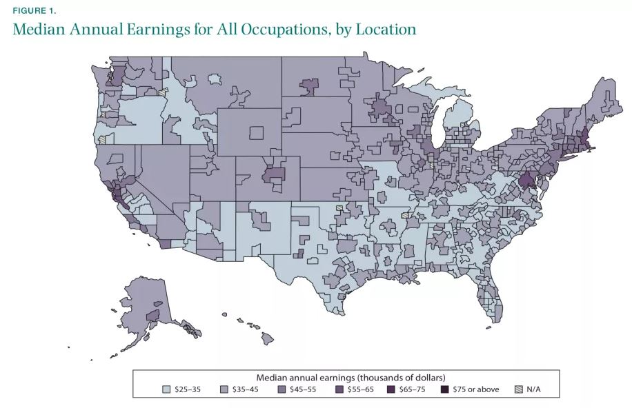
Geography matters a great deal for earnings, as well. The United States can be divided into metro areas (cities and their surrounding areas) as well as state nonmetro areas (the parts of a state not included in any metro area). Together, we use the term “locations” to refer to areas included in this analysis. There are 373 metro areas included in this analysis and 47 nonmetro areas; almost every state has one nonmetro area in our calculation.[5] At the bottom of the range, median earnings are $26,000 in Sebring, Florida, while at the top of the range median earnings are $65,000 in San Jose–Sunnyvale–Santa Clara, California.

How much does location matters for earnings? After controlling for demographic differences, workers in the top 30 locations earn an average of 20 percent more than the median worker in the United States and 37 percent more than workers in the bottom 30 locations; median annual earnings are substantially higher in some locations than in others (see figure 1). Still, given the huge variation in individual earnings, location can only explain so much of individual variation. Differences in educational attainment account for 16 percent of the variation in earnings across workers, while age, race/ethnicity, sex, and occupation explain an additional 20 percent of the variation. A further adjustment for location accounts for another 1.5 percentage points of earnings variation.[6] This relatively small value does not mean that location is unimportant, just that individual characteristics mean more than regional ones.

Median Earnings for All Occupations, by Location

TYPICAL EARNINGS VARY CONSIDERABLY WITHIN OCCUPATIONS AND ACROSS LOCATIONS

There are some occupations with relatively little variation in earnings across locations, but where you work has an impact on what you earn for the vast majority of jobs. Perhaps surprisingly it is not always the location with the highest overall earnings that has the highest earnings for particular occupations. For example, while San Francisco–Oakland–Hayward, California, ranks fourth out of all locations in terms of overall median earnings, it ranks below the national median for 9 percent of occupations. Conversely, locations with low overall earnings often feature higher earnings in certain lines of work. Nineteen of the lowest 20 wage locations have at least one occupation paid at the national median or better.

Earnings differences within occupations and across locations can be quite large. For example, median earnings of computer software developers are lowest in Lubbock, Texas ($49,600) and highest in Santa Cruz–Watsonville, California ($135,000). At the other end of the earnings distribution, kitchen workers earn the least in Indianapolis–Carmel–Anderson, Indiana ($11,300) and the most in San Francisco–Oakland–Hayward, California ($25,300). Recent work by David Deming and Lisa Kahn suggests that some of this variation within occupations exists because the same occupation requires a different set of tasks and skills in different locations.

To illustrate how wages vary within a particular occupation, figure 2 presents median annual earnings for registered nurses, one of the occupations with the largest number of workers, by location. Registered nurses have the highest earnings ($101,300) in San Francisco–Oakland–Hayward, California and the lowest ($40,000) in Valdosta, Georgia. In appendix figure 1, you can see how earnings increase with age within each separate location. The interactive associated with this report allows users to input any occupation to show median earnings by location and age.

Median Earnings for Registered Nurses, by Location

PLACES WITH THE SAME OVERALL EARNINGS NONETHELESS HAVE ADVANTAGES AND DISADVANTAGES IN PARTICULAR OCCUPATIONS

How much location matters to earnings—and in which locations a person would earn more—depends on the occupation. To illustrate how earnings vary within occupations by location, for figure 3 we selected 9 of the 20 most common occupations; each vertical line represents the median earnings in that occupation in a particular place. If an occupation’s wages are more variable across locations, as with registered nurses, then where you live matters more for your wages. For occupations with less dispersion, like truck drivers, where you live matters less for your wages.

To show how earnings in occupations vary when comparing the same locations, figure 3 highlights six metro areas with median earnings that are all roughly at the level of the median location in the United States.[7] Earnings dispersion for these locations with similar overall median earnings varies widely across the occupations we selected. For example, the median primary school teacher in Riverside–San Bernardino–Ontario, California, earn $66,900 ($27,200 above the median earnings for that metro area), while primary school teachers in Wichita, Kansas; Morgantown, West Virginia; New Orleans–Metairie, Louisiana; and Jacksonville, Florida, are paid close to the median earnings for those locations. By contrast, occupations such as truck, delivery, and tractor drivers, as well as construction laborers, have a much more condensed distribution, with similar earnings across the six metro areas.

There are meaningful differences in average wages across locations, but a substantial amount of variation remains at the location-occupation level, as figure 3 helps show. It is not always the case that places rank in the same order for any given occupation. Only 6 percent of occupations have a ranking that is correlated at above 0.5 with the ranking of overall median wages. In fact, more than two-thirds of occupations have a correlation below 0.3. In part, this could be due to differences in the mix of people working in different occupations.

Distribution of Median Annual Earnings across Locations, Selected Occupations

THE VALUE OF A DOLLAR DEPENDS ON WHERE YOU LIVE

Given that a select few metro areas in the West and the Northeast have the highest wages, we might expect many more people to move to these places than already have.[8] But wages are not the only consideration for people making decisions about where they choose to live and work.

One reason that many people choose to reside and work outside high-wage locations is a lower cost of living in other parts of the country. A lower cost of living—including cheaper housing, food, education, transportation, and other goods and services—allows the same dollar of wages to stretch farther. A worker in a metro area with a relatively low cost of living (e.g., Dallas) might think twice before accepting a slightly better-paying position in a metro area with a higher cost of living (e.g., San Francisco).

Cost of living in the San Francisco metro area is not high simply because it is dense or because residents earn a high wage, however. Deliberate policy choices such as land-use restrictions have contributed to sharply rising rents and home prices, limiting the number of people who can access the economic opportunities in high-wage cities.[9] This in turn limits U.S. economic growth and allows a divergence between incomes in different places.

What does this mean for individual workers? Using the Bureau of Economic Analysis’ (BEA’s) regional price parities (RPPs), we can see just how much higher or lower the cost of the same bundle of goods and services is in each location relative to the national average cost. The RPP is calculated using prices from the Consumer Price Index and housing rents from the American Community Survey; each location’s RPP represents how much higher or lower (in percent terms) prices are in that location compared to the U.S. average.

Table 1 shows 12 locations with the same annual median earnings ($40,505) but different costs of living, giving a sense of how substantially cost of living can vary across the country. Santa Fe, New Mexico, has a cost of living index (–0.2) just slightly below the national average. By contrast, the cost of living in Auburn–Opelika, Alabama, is about 15 percent lower than the national average, while the cost of living in Atlantic City–Hammonton, New Jersey, is almost 4 percent higher. When adjusted for cost of living, $40,505 in earnings is worth $47,900 in Auburn–Opelika, Alabama, whereas in Atlantic City–Hammonton, New Jersey, that same $40,505 is worth only $39,100.

Median Annual Earnings with and without Adjustment for Cost of Living, Selected Locations

Figure 4 shows median annual earnings versus cost-of-living index by location and region.[10] Note the clear upward sloping relationship: higher-earning areas (the x-axis) tend to be those with higher cost of living (the y-axis). In fact, there are no locations with a cost of living above the national average that have earnings less than $32,000, and no locations with a cost of living below the national average that have median earnings above $50,000. For every $1,000 more in earnings the cost of living is on average 1 percentage point higher. For example, moving from a $40,000 to a $50,000 median wage location would lead to a cost-of-living index that is 10 percentage points higher, offsetting 44 percent of the increased salary. The figure also shows that metro areas in the West and Northeast tend to have higher costs of living than do metro areas in the South and Midwest. After adjusting for cost of living, locations in the Northeast and Midwest tend to feature the highest earnings.

Median Annual Earnings versus Cost-of-Living Index, by Location and Region

While income taxes do not vary as much between regions as does the cost of living, taxes are an important consideration when comparing wages across the country. It might be more difficult to interpret differences in taxes than it is to interpret differences in cost of living, however. States with high taxes spend some of their extra revenues on public goods that are valued by residents, which partially offsets the burden of income taxes. Figure 5 shows the importance of these adjustments, plotting unadjusted median annual earnings versus earnings that are adjusted for both cost of living and federal and state income taxes, by location.[11] To be clear, this figure does not provide a full picture of local tax burden, which can vary additionally through sales taxes and the relative weight of income and property taxes. Locations with high unadjusted earnings also tend to have high adjusted earnings; there is a clear upward sloping relationship in the figure. However, the relationship is not one for one: some of the higher earnings are eroded by taxes and cost of living. In other words, higher cost of living and taxes reduce—but do not eliminate—the labor market advantage of high-wage locations.

Median Annual Earnings versus Cost-of-Living- and Tax-Adjusted Earnings, by Location

HOW TO THINK ABOUT CHOICE OF LOCATION

People choosing where to live and work generally factor in their future earnings, cost of living, and taxes. However, these are not the only relevant considerations. Amenities such as temperate weather, air quality, nightlife, and cultural attractions are all nonwage benefits that differ from location to location. By knowing their own relative preferences for these amenities as well as for earnings, workers can make decisions about the best location for them.

The difficulty for researchers is that the values of amenities—unlike the value of wage earnings—cannot be directly observed. Instead, an indirect approach is used: researchers examine workers’ implicit willingness to accept lower wages and/or a higher cost of living in exchange for amenities that they value. An example of this is that many cities in the West (often those on the coast) have high costs of living relative to their median earnings (as can be seen in figure 4). This may reflect that these cities are attractive places to live, leading many people to accept slightly lower cost-of-living-adjusted wages in order to live there.

This approach to estimating amenities has proven very useful, particularly when adjustment is made for taxes and nonhousing cost of living, as has been done in a number of recent papers by economist David Albouy and others.[12] For instance, one common assertion is that postwar migration to the South occurred because of an increasing taste for sunshine and warm weather. However, work by economists Edward Glaeser and Kristina Tobio shows that this was likely not the case, given the extent to which cost-of-living-adjusted earnings have risen in that region.

Amenities are not experienced in the same way by all people. Overall, less-educated workers are less willing to pay for amenities while more-educated workers are willing to pay particularly high premiums for amenities such as restaurants and clean air, for example.

CONCLUSION

The Hamilton Project has released a series of interactives that help people see how the decisions they make help shape their earnings over time. With Major Decisions, users can input different postsecondary majors to see age-earnings profiles and lifetime earnings by major. In Putting Your Major to Work, users can input an academic major, gender, and age group to see the top occupations as well as median earnings and work status for people with that major and in those occupations. The most-recent interactive—Where Work Pays: Occupations and Earnings across the United States—allows users to select an occupation and age group and to adjust for cost of living and tax expenses to examine the distribution of earnings across the United States by metro/nonmetro areas or by state.

Educational and occupational choices matter a great deal to workers’ careers. In addition, where workers choose to live matters significantly in many occupations. As this economic analysis has shown, there is a wide range of wage outcomes across locations in the United States. Typical pay is substantially higher in some locations than in others, though the location of the highest pay varies depending on occupation. Higher pay is sometimes partially offset by higher cost of living and taxes, depending on location, but higher cost of living and taxes are balanced in some locations by nonwage amenities that attract workers. Understanding how all of these factors—earnings, cost of living, taxes, and amenities—vary across the country is necessary for a complete account of labor market outcomes.

APPENDIX

Appendix figure 1 shows median annual earnings of locations (the gray and colored lines) by age group. Each gray line is the age-earnings profile for a particular location, while the colored lines show a few select metro areas with differing patterns across age groups. San Jose–Sunnyvale–Santa Clara, California, has the highest earnings profile, reaching $77,400 for 35- to 44-year-old workers.

Median Annual Earnings, by Age Group and Location

ACKNOWLEDGMENTS

The authors are grateful to Gabriel Ehrlich, Brad Hershbein, and Jed Kolko for insightful comments, and to Rachel Williams and Ben Delsman for excellent research assistance.